Friday 29 November 2013

Life Drawing - Two

Second life drawing session of the term.
Looking mainly at weight & the different techniques that can be used to explore weight & balance effectively.


Wednesday 27 November 2013

PPB - First Male Turnaround.


Also missed the refining process out regarding the male character...
I really need to take a step back & actually look at what I'm doing & how it's done. Really look!

Again the balance is off in this design, the male doesn't quite seem as if he's a body & in those clothes... & the faces is just a little odd on the side profile. Too short maybe...
Take two!! Again...

PPB - First Female Turnaround.


Okay, so basically after realising I have 3 or so weeks to create my Pre Production Bible I got stuck in in a massive way & tried to plough through the work at full force!
Only to later realise, I had to re do a lot of it...
I have the problem that once I start something I just need to get it done.
I forget about the refining process.
Which is pretty damn important!

So... After completely this turnaround. I decided to basically re do it...
The balance is off in these characters, the proportions aren't quite right & there is no real sense of character within the poses!
However I now have the technique down at least. Take two!!

PPB - Final Backgrounds


These designs are the final backgrounds for the animation. 
Went through a looooot of processes to get to these stages... the first background I did took a pretty long time...
Though I do like the results.
There's a dark, other worldly sense in textures & lighting creating a dark & unhappy atmosphere.
Just what I was going for!
Regarding Amazing Stories I used colour schemes taken directly from some of the pieces created. Also the use of texture & the wide appearance of brush strokes!


The police station interior is the area where the majority of the action happens!
So I have kept the lighting more simplistic & the space a little clearer allowing the characters to move around the elements.

Thursday 21 November 2013

PPB - Background Line Art

There are four main settings in my animation.

The police station; exterior & interior.
Prison; exterior & interior.

After revising my style, I felt the designs should be more realistic!
Far from what I'd originally imagined, but the challenge has been graciously accepted.
These are the basic digitised line drawings adapted from inked drawings I had done previously!
Slightly more complex & developed as buildings, working from references & other artists interpretations.
References which shall be posted shortly!


Sunday 17 November 2013

PPB - Luma Rouge


Luma Rouge is another pin up artists who's style I'm highly fond of.

Different to the regular pin ups in that she uses more of an exaggerated, squash & stretched character. Elongated limbs in particularly & extremely slender characters.
In an addition to a less traditional, less clean use of line & colour.


PPB - Paul Savulescu


'Amazing Stories' Covers has a cartoon like feeling about them, though not as obvious as the style of Paul Savulescu!

His style is more comic book like, similar to that of the art of Sin City. Mainly black & white, with bursts of colour to draw the viewers eyes to something happening within the scene.
Although too dramatic & comic style in some aspects for the painted, rendered style of Amazing Stories, I love the line art & the buildings he creates.
The use of shadow & the blacked out areas created a dramatic, dark atmosphere which is something needed in the dark - yet mildly amusing - nature of my animation.

The examples of his work here are actually backdrops for walls & buildings of a club for a 'Desperados'  promotion. 


PPB - Male Character Costume Design!


For the male character I went through the same process as the female.
Looking at more historical & interesting uniforms as references & doing simplistic sketches of the main details.
I felt more modern styles, again, wouldn't fit in with the style of the pin up female.
Plus I thoroughly enjoy a double breasted jacket!

Funny In 15 - Dogshite.


This is the final animation for our Funny In 15 project!
Everything has been slightly more exaggerated in the animating...
More violent excrement...
Enjoy!

Thursday 14 November 2013

PPB - Female Facial Design.


 Again the facial design of the female character was needed...
So as a reference I looked at people such as Dita Von Teese, Amber Heard in addition to classic pin up females.
I found that a lot of the characters I seemed to be drawing seemed to appear too... foreign. Whereas the majority of classic pin ups appear as the English Rose. So looking at myself  - a blonde, green eyed, pale female - seemed  to help slightly.  


However I wanted to modernise the character slightly & also give her more interesting, squashable & stretchable features!
But again I seemed to give my character a sense of something I do not want.
In the case of the above sketches, a weird manly look about her...

The drawings below I think work slightly better...
She  appears relatively similar in each of the sketches, holding distinctive features. 
I also think she looks like she could animated & exaggerated, which is what I need!
Plus working in coloured pencil makes everything look better...


Tuesday 12 November 2013

PPB - Olivia De Berardinis


Consider my pin up style character, pin up girl references are required!
I discovered Olivia De Berardinis, famous for painting the muse Dita Von Teese.
I wanted some feel for the poses & body shapes & curves & the exaggerations of the females.
Here are some examples of my favourites...


Pre Production Bible - Female Character Costume Design!


The costume of the female character was very much improvised for the concept pieces & I, am in fact ashamed to admit, that I used no references... I am a bad designer...
So in an attempt to redeem myself & the costume I have looked at past police women's uniforms!

Due to the pin up style I felt more modern uniforms wouldn't be so fitting of the style... or quite so fetching. 
Though the women who were depicted in the older uniforms weren't quite as sexy as I've made them out to be... My original vision of the character was relatively dark & moody looking, relatively unrealistic. An unsexualized character.

But the style of the female Amazing Stories Covers are pin up style, sexy characters! 
The development of the character has led me to enjoy the contrast of characteristics.
The sexy character is normally playful, smiling, flirtatious...
Whereas my protagonist is fiery, moody, frustrated & cannot get what she wants.

The sketches below are from old photographs of female police uniforms, though put onto a pin up style model. My favourite of the designs is the centre, but I felt the tight, pencil skirt would lead difficult to animation. Restrictive of movement!


So I combined several! Flowing skirt, with the smarter more professional jacket. Shirt & tie to avoid the unnecessary flash of flesh, hiding the cleavage to desexualize her minimally!


Friday 8 November 2013

Dream Sequence Style


For the 'dream' sequence within the animation - in which the character is day dreaming of running after some form of criminal, leaping on him, taking him out & holding a gun to his face - I wanted to use a different style in order to clarify the two different worlds.

Several of my favourite Amazing Stories' Covers were in a monoprinted style. No outline, just coloured textures creating shapes. 
I wanted quite a dramatic sense so using the contrast of red & black is strong, using the blue to make the character definable due to her blue outfit in the other scenes. 
I also used the fencing in the background for - well what I hoped to appear as - a metaphor for the bars of a prison cell. Clever right?!


Pitch Concept Art - Action Scene


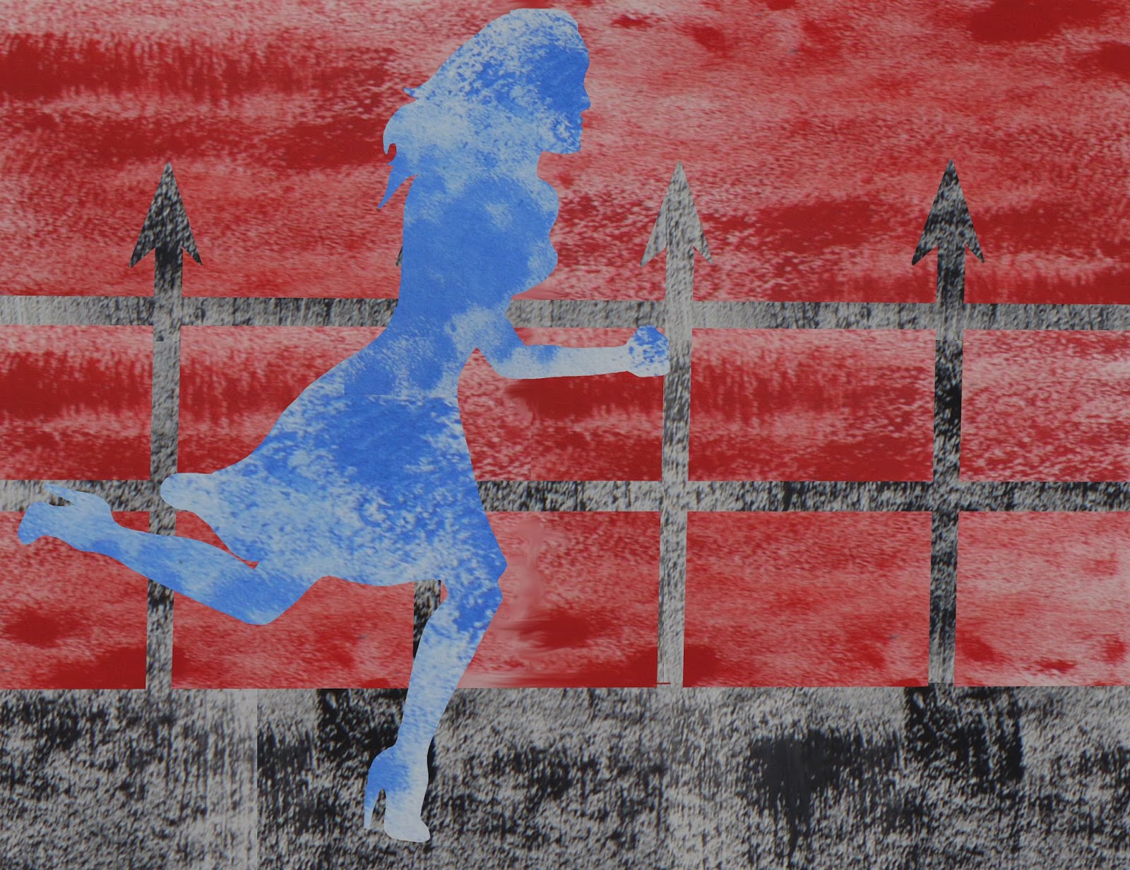
During the pitch rehearsal & watching other students pitches, it occurred to me that I was missing something relatively vital in my images...
Some excitement.
Which was my feedback after my rehearsal pitch. I required an exciting action image as a concept piece  & to make the telling of the story highly exciting & action filled!
So I created this piece - late last night filled with panic before my pitch today - illustrating the blood she'd caused by their fatal error & her excitement & need. 
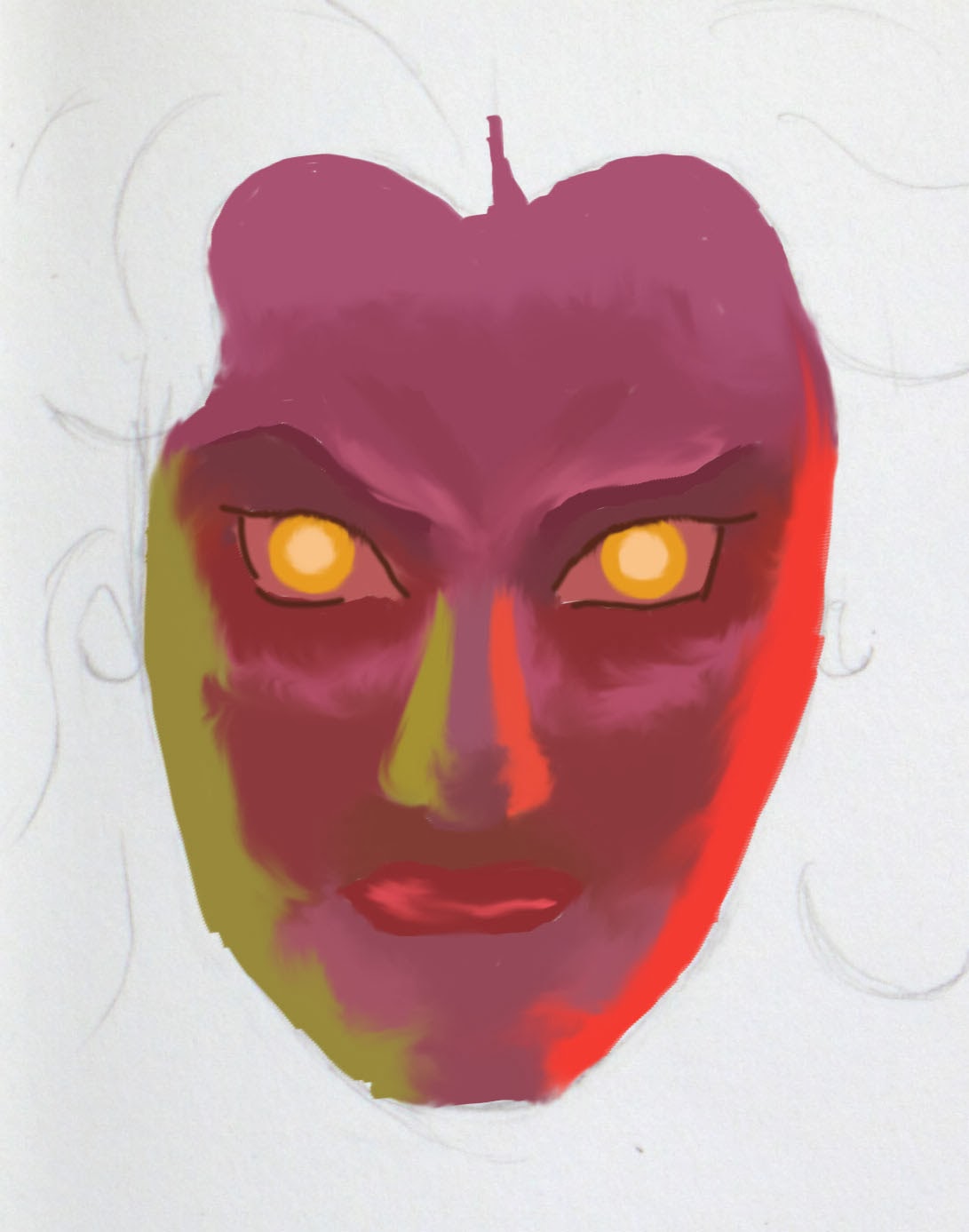
I also revised my notes & storytelling style to increase the excitement & people's interest in the storyline!

So here's my basic story outline...;
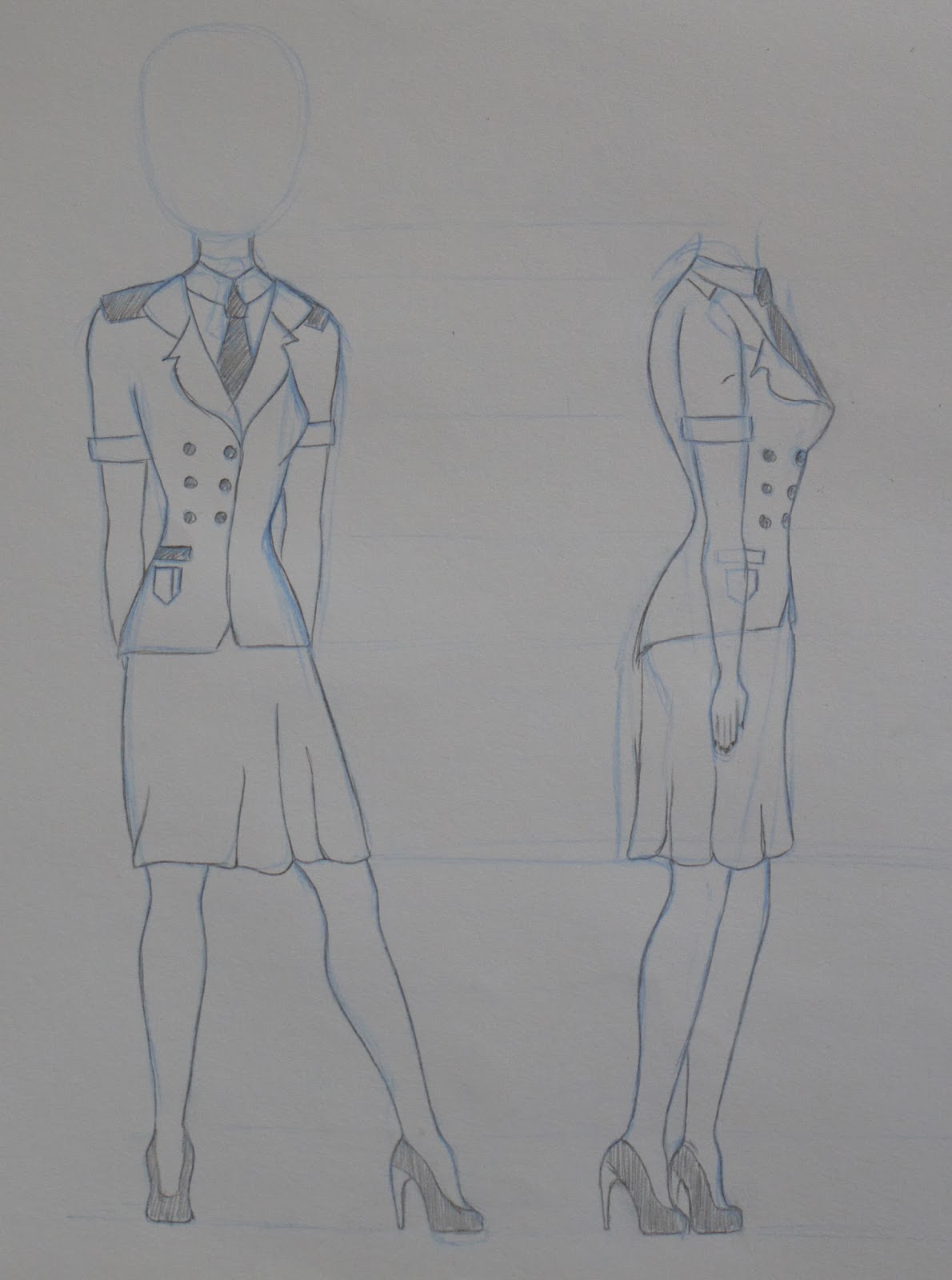
Push The Envelope is the story of a young female police officer working a make dominated police force.

The female protagonist is entirely fed up of pushing the paperwork & the monotony of the office.
She dreams of fighting crime. Dreams of the chase! The takedown! Holding a gun to the perpetrator's head!

After a morning of day dreaming, her male counterparts return from an exciting crime fighting adventure.
Flying into a jealous rage, she goes completely off the handle. Much to the shock of the males in the office...

In fear of the crazy scorned lady screaming in the corner, they hand her a gun to appease her. Though sheepishly, & much to her excitement.
This was a fatal error.
Her excitement - & inexperience - leads to the accidental firing of a bullet.
Bullets bounce. Tables crack. Emergency lights flash!

Once calm returns, the consequences are revealed.
Bullet holes surround her. Blood squirts everywhere.
& after her brief moment of excitement, she is returned to her life of monotony...
In prison.
Serving food to those she wished to fight.

THE END...


Thursday 7 November 2013

Life Drawing - One

First life drawing session of the term.
Trying to get back into it...
Taking my time. Slowly.


Wednesday 6 November 2013

Interior Background Development - Digital


As opposed to drawing & inking & repainting the whole drawing again, I simplified (well I thought it would be simpler...) & shortened the process.
Created the line art in Photoshop & similarly to the process of adding texture & colour to the female character, I copied the textures from the original painting. Created brushes to add shadow & further detail.

Let's just hope the perspective is slightly better this time...
I spent quality time staring at my dining table trying to work out how it should look...


Interior Background Development - Painted


Initial background ideas based on one of the covers previously posted, with neutral tones of yellows & blues creating a cold, unhappy tone within the scene.
The top painting was a very rough experiment in an attempt to decide the use of tones for the background.
The second painting was a slightly more complex design, bring in more of a sense of shadow & depth, adding in additional details. Taking the image into Photoshop, black lines were added to enhance the line art & detail.


Then I added the character in.
& I realised something was not quite right...
& it actually took me a really long time to work out what it was. A really, really long time.
Then my flatmate mentioned that the perspective was completely off. & I then wondered how I never noticed as it was so damn obvious.
The audience appears to be looking down on the table from above, but looking directly at the character at the same time... Not possible.
So decided to draw it again. Of course.


Amazing Cover Stories - Getting Into The Style...


The style I was given for my animation is pretty much the opposite to how I had envisioned the animation to look... as a black comedy with a moody female character, I had envisioned angular, dark animation with a non sexualised character.

So to get Amazing Cover Stories in which the girl's appear as pin up style character's the, a sense of realism in a lot of the characters & often a highly rendered style, well... It has been a struggle to divert my thoughts onto this path... But I shall!

In an attempt to get into the feel of the style, I chose a few images which I thought could possibly aid me in developing my characters further... Experimenting in different mediums; pencil, digital, watercolour, acrylic, ink it has given me a feel for the direction I think I'd like to go in.


Pitch Concept Art


These are the concept images created for the pitch, based on the cards of 'Black Comedy', 'Push The Envelope' & the style of 'Amazing Stories Covers'.
In the end I combined two different styles from several of my favourite covers. I chose the dull, blue/yellow toned background to contrast the dark blues of the character, ensuring she was not lost in the background. In addition to implying the cold, dark mood of the environment.


I felt at first that the character stood out slightly on the background & as I wanted her as the concentrate of the scene, adding detail to her would draw in the viewers eyes.
Giving her a subtle, warmer glow contrasts the character within the background. The flecks of light is a detail I picked up from one of the Amazing Stories covers that I had replicated, which I carried over which I think gives it a sense of surreality.
The use of texture is what I think brings the image together as both were created using acrylic textures & overlays, although I think in some instances the skin could possibly use more texture.


The third image is the idea for her 'dream', or thought sequence, when we gain some insight into her mind. The scene is a relatively simple chase scene with the female character chasing a male perp. Again based on a mono print style of the Amazing Stories covers, I added the detail of the flecks of light floating her around her - as seen previously - to create a sense of familiarity with the character.

Overall I'm pleased with the visuals I've created, however I think the character possibly needs a little more work & development. But due to the time frame & attempting to rethink how I had envisioned the animation, this will have to be developed further later.


Monday 4 November 2013

Character Development - Sketches

Some first sketches of my character after considering the 'Amazing Stories Covers' style.


Some idea taken very much from images I had copied previously, trying to add details of the pin up girl appearance. Such as;
Curled, flowing hair.
Larger breasts.
More dainty, realistic features.


Character Development - Colour


Having sketched my character in a more pin up stylised way, colour experimentation needed to come next... Trying to keep it minimal I used only two or three colours, as well as in order to keep the focus on her  & not the background. But I also needed to consider how I would animate the character, so the process of colouring couldn't be too lengthy...

I have experimented with...;
Watercolour & acryllic painting.
Digital block colour.
Using water colour texture.
Using acrylic texture.
Use of shadow.
Using block colour.
Not using outlines.


In keeping with the style I think a textured version is required to keep it slightly more traditional looking & add different tones of colour & depth to the character. Personally I prefer the details with the shadows, however this is obviously a longer process. So although I intend to take it through the concept process, it may be dropped when animating... 
Once backgrounds have been completed, experimenting with which paint style works as an overlay will lead me to decide whether watercolour or acrylic textures work more effectively.