Thursday 30 May 2013

Ident


This is the final version of the Ident created for Falmouth Animation Course. Created mainly within Photoshop & ToonBoom.
I think the most effective parts of the animation are actually the use of sound effects as I think it creates a sense of tension as well as adding drama to the scene, particularly toward the end where the words fly toward the 'camera'.
The use of a monotone colour scheme adds to the drama of the scene creating a dark atmosphere within the animation.

Ident - Development

Developing my Ident idea, as oppose to creating it within After Effects as originally planned I decided to put it together within ToonBoom. Mainly due to my increased knowledge of ToonBoom in comparison to AfterEffects.

Creating the basic frames in Photoshop, I mainly created a variety of cloud shapes, the basic lightening shape & misty translucent frames to overlay. These frames were created relatively simplistically in Photoshop using the paintbrush tool to add colour & texture to later be transferred into ToonBoom.


Idents - Initial Ideas

Beginning on the basis of my experimental animation, my initial idea was to use ripped up paper to animate clouds moving across the screen with rain falling from each of the clouds. The rain falling at the bottom of the page would build up to create the word 'animation', then the clouds would part to reveal the Falmouth University logo.
Thinking about this idea in further detail I thought it may look naive & childlike due to the use of brash colours & the technique of ripped up further, so decided to take this idea in a different direction.

Developing the idea to take it to more professional level, I thought of creating a similar composition digitally. The basic concept of clouds moving across the frames, with rain falling. Thunder would begin to be heard & lightening would strike across the frame causing it to white out. The next frame would simply contain the words 'Falmouth University' & 'Animation', pausing briefly before the words flying toward the camera & viewer dramatically.

I'm considering creating this animation using a combination of Photoshop & Aftereffects. I think this particularly concept, would also enable to to use a variety of interesting sound effects.

Sea Project - Final Animation


This is the final outcome of our group sea project. As the first group project we've taken part in I think it went relatively well & we were able to bring our ideas & styles together relatively effectively.

I think that some areas of the animations weren't quite as pictured - for example the statuesque, floating heads - but overall the abstract style was as imagined with transitions & the blue tones & the increase in tension.

My main role was experimenting with the characters & drawing their facial features & expressions, then later editing these images.

Motion Studies Showreel


Motion studies consisted of looking a variety of movements & behaviours within characters.

I chose to do the first two pieces in 2D, which in hindsight I think I could have done better in 3D. I think some of the motions are slightly cliched or too exaggerated to the point of looking unnaturalistic.

The walks were my favourite animations to create as I was able to experiment with the characters emotion & their personality. For the walk cycles I watched a lot of references on the internet of people walking & I also watched several of my flatmates walking up & down as a reference. I think the best walk of the three is the happy walk, as the sense of speed & the bounce in the step is evident conveying the characters good mood.

Life Drawing


Some examples of life drawing for the motion studies module.
I think the main area I need to concentrate on within my life drawings is the sense of weight in the pose, as I don't think this is always conveyed - for example in the last drawing.

Newquay Zoo - Motion Studies


As part of our drawing project & motion studies we went to Newquay Zoo to watch animals & look at their movements & behaviour within their environments.

These are some examples of pages from my sketchbook of quick sketches & animals I've drawn. The first page is of a variety of animals, including a peacock, lizard & a baby goat. The second a selection of meerkat & mammal studies, & the third penguin studies. 

Thursday 23 May 2013

2D Toonboom Adaptation


I found the 2D adaptation an enjoyable process as I was able to animate in a different way using different software. At first I found Toonboom mildly confusing, but once I'd got hang of the basic skills & shortcuts it was relatively simple. The process of animating in Toonboom was a lot more simplistic as it adds keyframes for you, but in some cases this is also annoying as I'd be scaling things & a keyframe would appear.

I think the use of the pan is effective as it highlights the animation of the leaf & the zoom into the background highlights the movement of the butterfly across the leaf. I think that it could possibly improved if there was a clearing within the background.


3D Modelling


The modelling was the area of the project I was most concerned about due to inexperience within Mudbox, but I also enjoyed this project more!

After simply modelling a cube in Maya & adding subdivisions, I was able to create the basic shape of
my rock. Transferring this basic model to Mudbox, I sculpted it further using my photograph as reference. I found this stage of the process most enjoyable, but also the most frustrating. Once I'd begun the modelling & sculpting process I found it difficult to stop. I enjoyed creating the details, but found when changing & editing one area another would inadvertently change. So I had to stop myself from 'overworking' the piece. Once I was happy with the shape created, I painted my image onto the model - attempting to avoid blurring - & then created a bump map to add texture.

The final product was relatively successful in my opinion, but doesn't look exactly like my original reference image. I would have liked to have reference images from all angles of my chosen object, but the situation in which I took it mean that it wasn't possible. After completing this project I think modelling & texturing would be something I'd like to experiment with further.


3D Modelling Adaptation


As someone who doesn't predominantly work in 3D, I was under the impression this project would be more difficult & less enjoyable than anticipated.

The adaptation process, once started, was relatively simple. I found the most difficult part of the process adding the images to the planes & creating the transparency, due to the amount of steps. But once I'd done this several times, the process was engrained in my mind.

Sculpting the layers was more simplistic, but I found when I began I didn't create enough divisions, meaning I was limited to the amount of detail I could create. I also struggled with the idea of the progression camera, as I was frequently unable to see certain details. When attempting to adjust the frames in order to make details visible, the sculpting was often affected.

I don't think the the image I'd chosen was particularly well adapted to 3D due to the relatively small details of the foliage in one of the layers, as I was unable to sculpt them 'deeply' to give a more 3D effect. If I was to this piece again I'd also separate the mountainous areas to create more of a sense of depth.


Monday 13 May 2013

Painted Exterior - Progression


In creating the exterior background, I went through a similar process as the interior. Blue pencil drawing, watercolours & then Photoshop. 
The exterior was more simplistic in my opinion with regards to painting the design. Although I did find it difficult to stop myself overworking the paper when I wanted to add further detail. The idea of features becoming paler the further in the distance was valid in this design due to canyons in the background & the contrast of features in the foreground. 
Again I added white highlights within Photoshop & edited to the colour balance to lose the sepia tones & darken the edges which should appear more in shadow. I was undecided as to whether to ink the image to add further detail, as I think the pale less defined background fits this design.

Painted Interior - Progression


These images illustrate the progression of the interior background designed from my previous Knight Rider storyboard.

I found this particular background a huge challenge due to the interior being a car. As something I'd never even considered drawing before I found creating the correct perspectives very difficult & when attempting to paint details this was an additional problem as my reference photograph didn't contain distinct light sources. 
When I began painting the main thing to take into consideration was how I was going to input the two light sources, one a strong focus & the other a softer source. The main source I decided upon is the clock in the centre as it enabled me to add stronger highlights & create high contrast. The second being more subtle in the the rear view mirror.

Due to the amount of detail I decided to ink the car design to make certain areas clearer & less soft & 'fuzzy'. I later added further detail & highlights in Photoshop as I struggled to add white highlights using watercolour paints.

I think that the background was more successful than I imagined, but I didn't take into consideration the fact there would be a character sitting within the frame so some areas wouldn't require as much detail. I think the windscreen in this image is also slightly off as it would, realistically, have a slight slope due to the aerodynamics of the car. I may later add a very light simplistic background as a view through the windscreen/windows, depending on time.

Wednesday 8 May 2013

Facial Animation - Initial Keys


These are examples of the initial keyframes created for the group sea project. 
Obviously these are just the line drawn versions & later there will be backgrounds added & water splashes etc to fit in with the style of the animation & according to the animatic.
I think I need to add some additional frames to make it appear slightly smoother as well as extending the last expressions to make them appear more dramatic. However they take a little bit longer than anticipated & the process is relatively time consuming.
These versions are slightly jumpy as they haven't been scanned in just photographed for me to get an idea of what needs to be done next.

Tuesday 7 May 2013

Knight Rider - Interior

I found designing the interior background for the project more difficult than the exterior due to the fact it had to be based on the previous Knight Rider storyboard so I was limited as to my choices of interiors. My options were essentially the inside of a vehicle or the interior of the garage. I chose the interior or a vehicle, specifically a Mini Cooper, as I thought it would be more of a challenge for myself. 
In my first basic design, I noticed that some of the perspectives were incorrect so I would need to adjust those in the second drawing of the design. In drawing the second version I drew in the perspective lines to make sure it was accurate & also measured certain details in order to make it symmetrical. The next stages will be to consider the use of lighting & the sources of light within the interior & begin to paint the backgrounds.


Backgrounds - The Lorax


I recently watched Dr Seuss's The Lorax & found the backgrounds of the 'woodland' area very striking.
One of the reasons is obviously the use of very bright, almost luminous colours & the use of high contrast. But also due to the sense of perspective which is particularly visible in the last image & the use of objects - in the form of foliage - in the foreground.
They also illustrate some of ideas learnt in our background lessons, for example the way the further away from the 'camera' an object is the paler & bluer it is.


Stones & Minerals


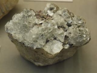
Examples of minerals & stones from the Royal Cornwall Museum in Truro.
Found that many of the examples created other recognisable shapes, for example the appearance of flowers or shells, or cubes within the rock & mineral formation.
I had also thought that some of the appearances of the surfaces would make good references in creating other worldly backgrounds & could also be used as a reference to create in 3D.


Truro Cathedral


Some examples of photographs taken during a drawing trip to Truro cathedral. 
The architecture of the cathedral was incredible with its combination of high ceilings, beams, stain glass windows & use of brickwork. I found looking up at the buildings incredible due to the perspectives & the sense of magnitude & thinking of how long it would have taken to have design & build.
The building is also incredibly well lit in combination with its windows & the artificial lighting, enhancing certain areas.
I took a large collection & variety of photographs from the location to capture the beauty of the building & also as I thought they could be very good references for buildings & architecture for backgrounds in the future if required.