Friday, 28 November 2014

Bottle - Layouts

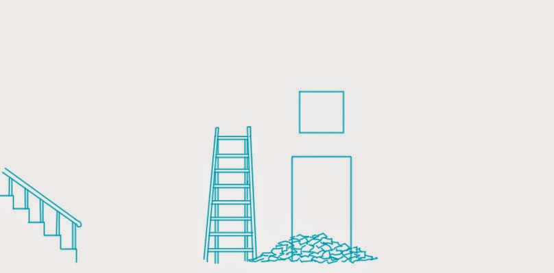
Examples of background layouts for Bottle - each element is on a separate layer so it is able to be moved around in the scene. Especially if it is an element to be interacted with.
Some of the shots are not regular 1080/920 format due to the changing screen size in bottle & also to be able to move the frame around the layout if required.
The Director will later make animation notes on this, sketching key positions & details within the frame to aid animators in understanding what is required.



Thursday, 27 November 2014

The Reel - Shark Character Design

Some basic character designs I had done previously for the project The Reel for one of their scenes which has now been cut, but I'll be doing further design work on other scenes.
Inspiration & reference for the designs on my Pinterest!

Monday, 24 November 2014

Personal Design Work...


I recently did some design work for local personal training company Defined Fitness - creating designs according their brief & clientele. In addition to creating the logo I've also created shaker & t-shirt designs (which have been made) as well as business cards.


Saturday, 22 November 2014

Christmas Cards! - Tis the Season to be Squatting...


Personalised christmas card designed by myself!
Mechanical pencil, white, red, yellow, gold & green prismacolour pencils & white gel pen on brown paper.

Wednesday, 12 November 2014

The Reel - Character Colour.


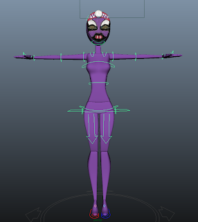
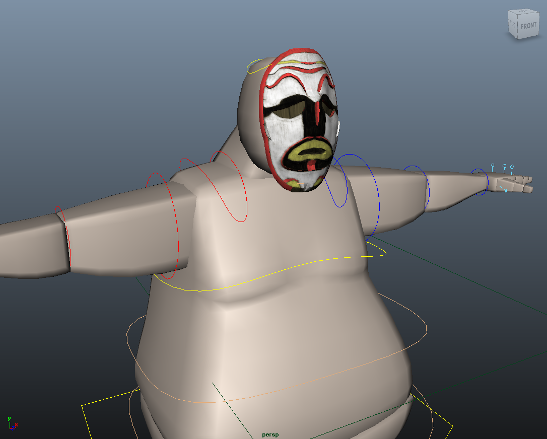
As previously mentioned there were some concerns that the skin tones of the characters would get lost in the background due to the neutral/brown tones of the rocks & stones. So I was asked to experiment with bold colours in keeping with the character details & designs of the masks. So these are examples of the colours on the characters, I personally feel like the colours are too bold & will contrast the backgrounds too much & will appear out of place - so it's been decided that the skin colour will be revisited once the scenes have been completed with colour & texture, as then the characters comped into the scenes can be assessed more easily & therefore changed to fit the scene more effectively.


The Reel - Jewellery Textures.


Jewellery experiments & texturing for the characters of the Reel - created from the original designs I created with some amendments to make them more texture friendly & so as not to cause too much distortion.
I used the same wood textures used for the masks & the same brush for consistency in through the model. Hopefully these details will also mean that the characters will be less lost when moving through the backgrounds.


Monday, 3 November 2014

The Reel - Mask Texturing.

Texturing is a very new thing to me & working on the Reel is the first time I've tried it since texturing & modelling a rock in first year...


I was given the UV unwrapped mask which Oly had modelled to add colour to as well as a wood like texture. Due to slight differences in the models & my original design the colours didn't match up exactly as they did previously. However I used the same colour schemes & basic design.
I also used a simple wood texture background to work on top of in a chalk like Photoshop brush to create a painterly wood texture type appearance.

The Reel - Character Skin Colours.

I also added the skin colour to the 3D characters on the UV unwrapped designs in Photoshop.
Initially I experimented with adding some details and muscle tone to the characters, however due to the character shapes the team felt it was unnecessary as the lighting and body shapes created enough detail, highlights and low lights.