Thursday, 18 April 2013

Experimental Animation - Tests


I found it difficult to originally come up with ideas on how to create my experimental animation, which is led it be inevitably difficult to get started. But after I point I decided to just throw myself in with whatever ideas that came into my head whether simplistic, strange or complicated & tried to consider using different media.

One of the first ideas I had come up with was creating a stop motion style animation of make up on a female’s face creating patterns or changing her facial expression or style, however upon trying this I discovered it was near impossible. As I had to keep applying make up to the model it wasn’t possible for her to be in exactly the same position in each frame, so she was constantly jumping around the frame. So I scrapped this idea.

I decided to begin experimenting with the use of paper in different ways. A more simplistic idea I created was the use of cut outs – in this case I chose butterflies - & made them move around frame & appear to flutter their wings subtly. This was slightly difficult due to the overlaying of the movements in their wings & such, making things more difficult to move & although I liked the subtle style of animation, I felt there wasn’t enough movement.

Ripping up pieces of bright coloured paper to create movements & morphing was the basic idea for my second experimental piece. Although difficult to create the exact shapes I wanted & difficult to move shapes once created due to the nature of media, I found it effective in creating interesting morphs & also found the highly contrasting colour scheme appeared effective.

My third test was probably the most simplistic of the three. Involving a thin layer of grains (quinoa in this case) lay over a brightly coloured sheet, where I then created patterns but creating space in between the layer of grains to allow the coloured paper underneath to show through.

I’ve chosen to take the idea of using ripped up pieces paper further, as I think it will enable me to experiment with using the idea of morphs from different things to others, whilst maintaining an interesting visual style due to the bright colour scheme.

Tuesday, 12 March 2013

Sea Animation - Character Inspirations


These are some examples of artists & illustrators that I used as references for styles to combine character ideas & water colours.

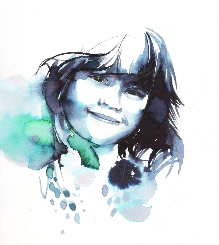
I chose the above images due to the loose style using smudges, blurs of paint & the brush stroke detail to add detail & create character within the designs. I also tried to choose images which use a similar colour scheme in order to get a feel of the ambience created in the images.

My favourite of the illustrations is the centre piece of the younger character.  I think it effectively illustrates the benefits of using watercolour, for example the running of colours & the  smudging of colours creating imperfections.

Thursday, 7 March 2013

Animation Backgrounds - Layout

I chose to base my animation background adaptation on one of Nathan Aardvark's illustrations, looking at a natural yet surreal world.   Looking at the main details - & my favourite details - of the layers of foreground & background in Aardvark's illustrations, I exaggerated & repeated the forms in order to created separate layers. For example in the foreground I used a collection of mushrooms & fungi in order to create the layer. The layer behind that incorporated the plants & more surreal details in the swirly patterned & shapes plants & flowers. The background layers consist of more simply mountainous regions & a cloud/sky layer.

I created a hand drawn version on tracing paper to give me some kind of idea & concept of how the layers would look like once incorporated - though some layers aren't quite visible.

The image to the left is the layers together in Photoshop. I think the layers work effectively together but it appears slightly busy on the right hand side, so I may need to take out some details. Probably the flower above the mushroom on the right, as most of the flower is lost anyway.

The next stage will be refining the line art & then thinking about a colour scheme for the layout. Taking into consideration the light source & how areas will be illuminated & in shadow.

Monday, 4 March 2013

Foundation FMP - Animation


This is the first animation I created during my foundation course prior to the digital animation course. Created in After Effects its a relatively simplistic animation based on the idea of comic book frames & superheroes.

Sea Animation Experiments


Some examples of rough experimentations for the group animation based around rescue stories of the sea. 
Our group had decided upon using 2D media & a slightly abstract appearance which led us to decide to  experiment with paints, in particularly water colours. These are some examples of ideas I've played with, simply playing with creating shapes & patterns with different shades of colours I'd consider to be related to the sea. 
I think the first set of experiments is more effective using watercolour as the textures are more visible & I think they work in illustrating the movement that would be in relation to the ocean. 
The second experiment was considered less effective mainly as the images were taken less consistently causing what appears as camera shake & less consistent.